
.hsmwdk,
.hsmwdk *{
box-sizing:border-box;
}
.hsmwdk{
width:100%;
color:#242424;
font-family:Poppins,sans-serif;
background:#ffffff;
}
.hsmwdk section{
width:100%;
max-width:100%;
margin-left:0;
position:relative;
}
.hsmwdk-inner{
width:min(1200px,calc(100% – 48px));
margin:0 auto;
position:relative;
z-index:2;
}
.hsmwdk h2{
margin:0 0 22px;
color:#202020;
font-family:Poppins,sans-serif;
font-size:28px;
line-height:1.25;
font-weight:600;
letter-spacing:0;
}
.hsmwdk p{
margin:0;
color:#4d4d4d;
font-family:Poppins,sans-serif;
font-size:18px;
line-height:1.75;
font-weight:400;
}
.hsmwdk strong{
color:#202020;
font-weight:600;
}
.hsmwdk-kicker{
margin-bottom:13px!important;
color:#d32f2f!important;
font-size:14px!important;
line-height:1.4!important;
font-weight:600!important;
letter-spacing:.12em;
text-transform:uppercase;
}
.hsmwdk-rule{
width:100%;
height:2px;
margin:28px 0;
background:linear-gradient(90deg,#d32f2f 0%,rgba(211,47,47,.35) 32%,rgba(80,80,80,.15) 100%);
}
.hsmwdk-hero{
padding:80px 0 70px;
background:#ffffff;
}
.hsmwdk-hero::before{
content:””;
position:absolute;
top:42px;
right:-70px;
width:260px;
height:260px;
border:1px solid rgba(211,47,47,.2);
}
.hsmwdk-hero-grid{
display:grid;
grid-template-columns:minmax(0,1.05fr) minmax(380px,.95fr);
gap:70px;
align-items:center;
}
.hsmwdk-hero-copy p + p{
margin-top:18px;
}
.hsmwdk-data-line{
display:grid;
grid-template-columns:repeat(4,minmax(0,1fr));
margin-top:34px;
border-top:1px solid #cfcfcf;
border-bottom:1px solid #cfcfcf;
}
.hsmwdk-data-item{
padding:20px 18px 20px 0;
border-right:1px solid #dddddd;
}
.hsmwdk-data-item:last-child{
border-right:0;
padding-right:0;
padding-left:18px;
}
.hsmwdk-data-item:not(:first-child){
padding-left:18px;
}
.hsmwdk-data-item p:first-child{
margin-bottom:3px;
color:#777777;
font-size:13px;
line-height:1.4;
font-weight:600;
letter-spacing:.08em;
text-transform:uppercase;
}
.hsmwdk-data-item p:last-child{
color:#202020;
font-size:18px;
line-height:1.45;
font-weight:600;
}
.hsmwdk-hero-art{
position:relative;
min-height:430px;
}
.hsmwdk-hero-art::before{
content:””;
position:absolute;
inset:42px 0 0 42px;
background:#f1f1f1;
}
.hsmwdk-hero-art svg{
width:100%;
height:auto;
position:relative;
z-index:2;
}
.hsmwdk-specs{
padding:72px 0;
color:#ffffff;
background:#202020;
}
.hsmwdk-specs h2,
.hsmwdk-specs strong{
color:#ffffff;
}
.hsmwdk-specs p{
color:#d7d7d7;
}
.hsmwdk-specs .hsmwdk-kicker{
color:#ff6b66!important;
}
.hsmwdk-spec-grid{
display:grid;
grid-template-columns:minmax(260px,.72fr) minmax(0,1.28fr);
gap:70px;
align-items:start;
}
.hsmwdk-table{
width:100%;
border-collapse:collapse;
table-layout:fixed;
}
.hsmwdk-table tr{
border-bottom:1px solid rgba(255,255,255,.18);
}
.hsmwdk-table tr:first-child{
border-top:1px solid rgba(255,255,255,.18);
}
.hsmwdk-table td{
padding:17px 0;
vertical-align:top;
}
.hsmwdk-table td:first-child{
width:42%;
padding-right:22px;
}
.hsmwdk-table td:first-child p{
color:#a9a9a9;
}
.hsmwdk-table td:last-child p{
color:#ffffff;
font-weight:500;
}
.hsmwdk-structure{
padding:88px 0 78px;
background:#ffffff;
}
.hsmwdk-structure::after{
content:””;
position:absolute;
left:-60px;
bottom:55px;
width:220px;
height:80px;
background:#d32f2f;
opacity:.08;
}
.hsmwdk-two-col{
display:grid;
grid-template-columns:minmax(360px,.92fr) minmax(0,1.08fr);
gap:78px;
align-items:center;
}
.hsmwdk-figure{
position:relative;
padding:34px 24px 20px 0;
}
.hsmwdk-figure::before{
content:””;
position:absolute;
left:28px;
top:0;
right:0;
bottom:40px;
background:#f3f3f3;
}
.hsmwdk-figure svg{
width:100%;
height:auto;
position:relative;
z-index:2;
}
.hsmwdk-detail-row{
display:grid;
grid-template-columns:54px minmax(0,1fr);
gap:20px;
padding:20px 0;
border-bottom:1px solid #dfdfdf;
}
.hsmwdk-detail-row:first-of-type{
border-top:1px solid #dfdfdf;
}
.hsmwdk-detail-index p{
color:#d32f2f;
font-size:15px;
line-height:1.5;
font-weight:600;
letter-spacing:.06em;
}
.hsmwdk-detail-copy p:first-child{
margin-bottom:4px;
color:#202020;
font-weight:600;
}
.hsmwdk-feeder{
padding:86px 0;
background:#f3f3f3;
}
.hsmwdk-feeder-grid{
display:grid;
grid-template-columns:minmax(0,1.05fr) minmax(360px,.95fr);
gap:76px;
align-items:center;
}
.hsmwdk-feeder-copy{
padding-left:34px;
border-left:4px solid #d32f2f;
}
.hsmwdk-feeder-copy p + p{
margin-top:17px;
}
.hsmwdk-feeder-art{
position:relative;
}
.hsmwdk-feeder-art::before{
content:””;
position:absolute;
width:72%;
height:76%;
right:-18px;
top:-18px;
border:2px solid rgba(211,47,47,.28);
}
.hsmwdk-feeder-art svg{
width:100%;
height:auto;
position:relative;
z-index:2;
}
.hsmwdk-canopy{
padding:86px 0;
background:#ffffff;
}
.hsmwdk-canopy-grid{
display:grid;
grid-template-columns:minmax(360px,.9fr) minmax(0,1.1fr);
gap:76px;
align-items:center;
}
.hsmwdk-canopy-art{
padding:30px 0 0 30px;
border-left:1px solid #bdbdbd;
border-top:1px solid #bdbdbd;
}
.hsmwdk-canopy-art svg{
display:block;
width:100%;
height:auto;
}
.hsmwdk-fact-band{
display:grid;
grid-template-columns:repeat(3,minmax(0,1fr));
margin-top:32px;
border-top:1px solid #cecece;
border-bottom:1px solid #cecece;
}
.hsmwdk-fact{
padding:19px 22px;
border-right:1px solid #d9d9d9;
}
.hsmwdk-fact:first-child{
padding-left:0;
}
.hsmwdk-fact:last-child{
padding-right:0;
border-right:0;
}
.hsmwdk-fact p:first-child{
margin-bottom:4px;
color:#d32f2f;
font-size:14px;
line-height:1.4;
font-weight:600;
text-transform:uppercase;
}
.hsmwdk-fact p:last-child{
color:#2b2b2b;
font-weight:500;
}
.hsmwdk-use{
padding:78px 0;
color:#ffffff;
background:#242424;
}
.hsmwdk-use h2,
.hsmwdk-use strong{
color:#ffffff;
}
.hsmwdk-use p{
color:#d4d4d4;
}
.hsmwdk-use .hsmwdk-kicker{
color:#ff6b66!important;
}
.hsmwdk-use-grid{
display:grid;
grid-template-columns:minmax(270px,.72fr) minmax(0,1.28fr);
gap:72px;
}
.hsmwdk-checks{
display:grid;
grid-template-columns:1fr 1fr;
column-gap:44px;
}
.hsmwdk-check{
padding:20px 0;
border-top:1px solid rgba(255,255,255,.17);
}
.hsmwdk-check:nth-last-child(-n+2){
border-bottom:1px solid rgba(255,255,255,.17);
}
.hsmwdk-check p:first-child{
margin-bottom:6px;
color:#ffffff;
font-weight:600;
}
.hsmwdk-procurement{
padding:88px 0 82px;
background:#ffffff;
}
.hsmwdk-procurement-head{
display:grid;
grid-template-columns:minmax(260px,.72fr) minmax(0,1.28fr);
gap:70px;
align-items:end;
margin-bottom:34px;
}
.hsmwdk-procurement-table{
width:100%;
border-collapse:collapse;
table-layout:fixed;
border-top:2px solid #d32f2f;
border-bottom:1px solid #bfbfbf;
}
.hsmwdk-procurement-table td{
padding:18px 20px;
vertical-align:top;
border-bottom:1px solid #d8d8d8;
}
.hsmwdk-procurement-table tr:last-child td{
border-bottom:0;
}
.hsmwdk-procurement-table td:first-child{
width:28%;
padding-left:0;
}
.hsmwdk-procurement-table td:nth-child(2){
width:23%;
}
.hsmwdk-procurement-table td:last-child{
padding-right:0;
}
.hsmwdk-procurement-table td:first-child p{
color:#202020;
font-weight:600;
}
.hsmwdk-status-confirmed{
color:#2f6e4f!important;
font-weight:600!important;
}
.hsmwdk-status-check{
color:#d32f2f!important;
font-weight:600!important;
}
.hsmwdk-quote{
padding:76px 0;
background:#f2f2f2;
}
.hsmwdk-quote::before{
content:””;
position:absolute;
right:6%;
top:-50px;
width:180px;
height:180px;
border:22px solid rgba(211,47,47,.07);
}
.hsmwdk-quote-grid{
display:grid;
grid-template-columns:minmax(300px,.76fr) minmax(0,1.24fr);
gap:72px;
align-items:start;
}
.hsmwdk-quote-item{
display:grid;
grid-template-columns:64px minmax(0,1fr);
gap:20px;
padding:17px 0;
border-bottom:1px solid #d2d2d2;
}
.hsmwdk-quote-item:first-child{
border-top:1px solid #d2d2d2;
}
.hsmwdk-quote-item p:first-child{
color:#d32f2f;
font-size:15px;
font-weight:600;
}
.hsmwdk-quote-item p:last-child{
color:#2e2e2e;
}
.hsmwdk-faq{
padding:88px 0;
background:#ffffff;
}
.hsmwdk-faq-head{
max-width:760px;
margin-bottom:34px;
}
.hsmwdk-faq-row{
display:grid;
grid-template-columns:70px minmax(250px,.65fr) minmax(0,1.35fr);
gap:28px;
padding:25px 0;
border-top:1px solid #d4d4d4;
align-items:start;
}
.hsmwdk-faq-row:last-child{
border-bottom:1px solid #d4d4d4;
}
.hsmwdk-faq-row > p:first-child{
color:#d32f2f;
font-size:15px;
font-weight:600;
}
.hsmwdk-faq-row > p:nth-child(2){
color:#202020;
font-weight:600;
}
.hsmwdk-note{
margin-top:34px;
padding:24px 28px;
border-left:4px solid #d32f2f;
background:#f5f5f5;
}
@media(max-width:980px){
.hsmwdk-hero-grid,
.hsmwdk-spec-grid,
.hsmwdk-two-col,
.hsmwdk-feeder-grid,
.hsmwdk-canopy-grid,
.hsmwdk-use-grid,
.hsmwdk-procurement-head,
.hsmwdk-quote-grid{
grid-template-columns:1fr;
gap:42px;
}
.hsmwdk-hero-art{
width:min(680px,100%);
min-height:0;
margin:0 auto;
}
.hsmwdk-two-col .hsmwdk-figure{
order:2;
}
.hsmwdk-canopy-art{
width:min(680px,100%);
margin:0 auto;
}
.hsmwdk-faq-row{
grid-template-columns:54px minmax(0,1fr);
}
.hsmwdk-faq-row > p:last-child{
grid-column:2;
}
}
@media(max-width:720px){
.hsmwdk-hero-art svg,
.hsmwdk-figure svg,
.hsmwdk-feeder-art svg,
.hsmwdk-canopy-art svg{
transform:none;
}
.hsmwdk-hero-art svg,
.hsmwdk-figure svg,
.hsmwdk-feeder-art svg,
.hsmwdk-canopy-art svg{
max-height:360px;
}
.hsmwdk-inner{
width:min(100% – 28px,1200px);
}
.hsmwdk h2{
font-size:24px;
line-height:1.3;
}
.hsmwdk p{
font-size:16px;
line-height:1.7;
}
.hsmwdk-kicker{
font-size:12px!important;
}
.hsmwdk-hero,
.hsmwdk-specs,
.hsmwdk-structure,
.hsmwdk-feeder,
.hsmwdk-canopy,
.hsmwdk-use,
.hsmwdk-procurement,
.hsmwdk-quote,
.hsmwdk-faq{
padding:58px 0;
}
.hsmwdk-hero-grid,
.hsmwdk-spec-grid,
.hsmwdk-two-col,
.hsmwdk-feeder-grid,
.hsmwdk-canopy-grid,
.hsmwdk-use-grid,
.hsmwdk-procurement-head,
.hsmwdk-quote-grid{
gap:32px;
}
.hsmwdk-data-line,
.hsmwdk-fact-band,
.hsmwdk-checks{
grid-template-columns:1fr 1fr;
}
.hsmwdk-data-item,
.hsmwdk-data-item:not(:first-child),
.hsmwdk-data-item:last-child{
padding:16px 12px;
border-right:1px solid #dddddd;
border-bottom:1px solid #dddddd;
}
.hsmwdk-data-item:nth-child(2n){
border-right:0;
}
.hsmwdk-data-item:nth-last-child(-n+2){
border-bottom:0;
}
.hsmwdk-data-item p:last-child{
font-size:16px;
}
.hsmwdk-hero-art::before{
inset:24px 0 0 24px;
}
.hsmwdk-figure,
.hsmwdk-feeder-copy{
padding-left:20px;
}
.hsmwdk-detail-row{
grid-template-columns:42px minmax(0,1fr);
gap:14px;
}
.hsmwdk-fact{
padding:16px 12px;
}
.hsmwdk-fact:nth-child(2){
border-right:0;
}
.hsmwdk-fact:last-child{
grid-column:1/-1;
padding-left:0;
border-top:1px solid #d9d9d9;
}
.hsmwdk-checks{
column-gap:22px;
}
.hsmwdk-procurement-table,
.hsmwdk-procurement-table tbody,
.hsmwdk-procurement-table tr,
.hsmwdk-procurement-table td{
display:block;
width:100%!important;
}
.hsmwdk-procurement-table tr{
padding:18px 0;
border-bottom:1px solid #d8d8d8;
}
.hsmwdk-procurement-table td{
padding:4px 0;
border-bottom:0;
}
.hsmwdk-quote-item{
grid-template-columns:44px minmax(0,1fr);
gap:12px;
}
.hsmwdk-faq-row{
grid-template-columns:40px minmax(0,1fr);
gap:14px;
}
.hsmwdk-note{
padding:20px;
}
}
@media(max-width:480px){
.hsmwdk-data-line,
.hsmwdk-fact-band,
.hsmwdk-checks{
grid-template-columns:1fr;
}
.hsmwdk-data-item,
.hsmwdk-data-item:not(:first-child),
.hsmwdk-data-item:last-child{
padding:15px 0;
border-right:0;
border-bottom:1px solid #dddddd;
}
.hsmwdk-data-item:last-child{
border-bottom:0;
}
.hsmwdk-fact,
.hsmwdk-fact:first-child,
.hsmwdk-fact:last-child{
grid-column:auto;
padding:15px 0;
border-right:0;
border-bottom:1px solid #d9d9d9;
}
.hsmwdk-fact:last-child{
border-bottom:0;
}
.hsmwdk-check:nth-last-child(-n+2){
border-bottom:0;
}
.hsmwdk-check:last-child{
border-bottom:1px solid rgba(255,255,255,.17);
}
.hsmwdk-faq-row{
grid-template-columns:1fr;
}
.hsmwdk-faq-row > p:last-child{
grid-column:auto;
}
}
/* Product Design repair pass: WordPress full-bleed, no artificial offsets */
.hsmwdk{width:100%;max-width:none;margin:0;overflow:visible;–hs-accent:#d32f2f;–hs-dark:#242424;font-family:Poppins,sans-serif}
.hsmwdk > section{position:relative;width:100vw;max-width:100vw;margin-left:calc(50% – 50vw);margin-right:calc(50% – 50vw);box-sizing:border-box}
.hsmwdk-inner{width:min(1200px,calc(100% – 56px));margin:0 auto}
.hsmwdk-hero,.hsmwdk-specs,.hsmwdk-structure,.hsmwdk-feeder,.hsmwdk-canopy,.hsmwdk-use,.hsmwdk-procurement,.hsmwdk-quote,.hsmwdk-faq,.hsmwdk-cta{padding-top:80px;padding-bottom:80px}
.hsmwdk h2{font-size:28px;line-height:1.3;letter-spacing:0}
.hsmwdk p{font-size:18px;line-height:1.72}
.hsmwdk svg{display:block;width:100%;height:auto;max-width:100%;margin:0 auto;transform:none!important}
.hsmwdk-hero-art,.hsmwdk-figure,.hsmwdk-canopy-art,.hsmwdk-feeder-art{padding:28px;background:#f3f3f3;border:0}
.hsmwdk-hero::before,.hsmwdk-structure::after,.hsmwdk-feeder-art::before,.hsmwdk-quote::before{content:none!important}
.hsmwdk-procurement{background:#fff!important}
.hsmwdk-cta{background:#242424;border-top:4px solid #d32f2f}
.hsmwdk-cta h2,.hsmwdk-cta p{color:#fff}
.hsmwdk-cta-grid{display:grid;grid-template-columns:minmax(260px,.76fr) minmax(0,1.24fr);gap:56px;align-items:center}
.hsmwdk-cta-action{text-align:right}
.hsmwdk-cta-link{display:inline-block;padding:14px 22px;border:1px solid #ef5350;background:#d32f2f;color:#fff!important;font-size:16px;font-weight:600;line-height:1.4;text-decoration:none}
@media(max-width:1024px){
.hsmwdk-hero,.hsmwdk-specs,.hsmwdk-structure,.hsmwdk-feeder,.hsmwdk-canopy,.hsmwdk-use,.hsmwdk-procurement,.hsmwdk-quote,.hsmwdk-faq,.hsmwdk-cta{padding-top:68px;padding-bottom:68px}
.hsmwdk-hero-grid,.hsmwdk-spec-grid,.hsmwdk-two-col,.hsmwdk-feeder-grid,.hsmwdk-canopy-grid,.hsmwdk-use-grid,.hsmwdk-procurement-head,.hsmwdk-quote-grid,.hsmwdk-cta-grid{grid-template-columns:1fr;gap:42px}
.hsmwdk-cta-action{text-align:left}
}
@media(max-width:900px){
.hsmwdk-data-line{grid-template-columns:repeat(2,minmax(0,1fr))}
.hsmwdk-data-item,.hsmwdk-data-item:not(:first-child),.hsmwdk-data-item:last-child{padding:16px 14px;border-right:1px solid #ddd;border-bottom:1px solid #ddd}
.hsmwdk-data-item:nth-child(2n){border-right:0}
.hsmwdk-data-item:nth-last-child(-n+2){border-bottom:0}
.hsmwdk-procurement-table,.hsmwdk-procurement-table tbody,.hsmwdk-procurement-table tr,.hsmwdk-procurement-table td{display:block;width:100%!important}
.hsmwdk-procurement-table tr{padding:18px 0;border-bottom:1px solid #d8d8d8}
.hsmwdk-procurement-table td{padding:4px 0;border-bottom:0}
}
@media(max-width:760px){
.hsmwdk-inner{width:min(100% – 32px,1200px)}
.hsmwdk-hero,.hsmwdk-specs,.hsmwdk-structure,.hsmwdk-feeder,.hsmwdk-canopy,.hsmwdk-use,.hsmwdk-procurement,.hsmwdk-quote,.hsmwdk-faq,.hsmwdk-cta{padding-top:56px;padding-bottom:56px}
.hsmwdk h2{font-size:24px;line-height:1.34}
.hsmwdk p{font-size:16px;line-height:1.7}
.hsmwdk-cta-link{width:100%;text-align:center}
}
/* Final audit repair: prevent decorative overflow and improve narrow-screen readability */
.hsmwdk>section{overflow:hidden}
.hsmwdk-table td p,.hsmwdk-procurement-table td p{overflow-wrap:anywhere}
@media(max-width:760px){
.hsmwdk-checks{grid-template-columns:1fr;column-gap:0}
.hsmwdk-check{padding:18px 0}
.hsmwdk-check:nth-last-child(-n+2){border-bottom:1px solid rgba(255,255,255,.17)}
.hsmwdk-hero-art,.hsmwdk-figure,.hsmwdk-canopy-art,.hsmwdk-feeder-art{padding:18px}
}
@media(max-width:420px){
.hsmwdk-data-line{grid-template-columns:1fr}
.hsmwdk-data-item,.hsmwdk-data-item:not(:first-child),.hsmwdk-data-item:last-child{padding:15px 0;border-right:0;border-bottom:1px solid #ddd}
.hsmwdk-data-item:last-child{border-bottom:0}
}
/* Requested specification-panel refinement */
.hsmwdk .hsmwdk-specs,
.hsmwdk .hsmwdk-specs h2,
.hsmwdk .hsmwdk-specs p,
.hsmwdk .hsmwdk-specs strong,
.hsmwdk .hsmwdk-specs .hsmwdk-kicker,
.hsmwdk .hsmwdk-specs .hsmwdk-table td p,
.hsmwdk .hsmwdk-specs .hsmwdk-table td:first-child p,
.hsmwdk .hsmwdk-specs .hsmwdk-table td:last-child p{
color:#ffffff!important;
-webkit-text-fill-color:#ffffff!important;
opacity:1!important;
}
.hsmwdk .hsmwdk-specs .hsmwdk-table td:first-child p{
font-weight:600!important;
}
.hsmwdk-specs .hsmwdk-table{
border-left:1px solid rgba(255,255,255,.18);
border-right:1px solid rgba(255,255,255,.18);
}
.hsmwdk-specs .hsmwdk-table td{
padding:18px 24px;
}
.hsmwdk-specs .hsmwdk-table td:first-child{
width:38%;
padding-right:28px;
}
.hsmwdk-specs .hsmwdk-table td:last-child{
padding-left:28px;
padding-right:28px;
}
@media(max-width:760px){
.hsmwdk-specs .hsmwdk-table td{
padding:15px 16px;
}
.hsmwdk-specs .hsmwdk-table td:first-child{
width:42%;
padding-right:14px;
}
.hsmwdk-specs .hsmwdk-table td:last-child{
padding-left:14px;
padding-right:16px;
}
}
@media(max-width:520px){
.hsmwdk-specs .hsmwdk-table,
.hsmwdk-specs .hsmwdk-table tbody,
.hsmwdk-specs .hsmwdk-table tr,
.hsmwdk-specs .hsmwdk-table td{
display:block;
width:100%!important;
}
.hsmwdk-specs .hsmwdk-table tr{
padding:13px 16px;
}
.hsmwdk-specs .hsmwdk-table td,
.hsmwdk-specs .hsmwdk-table td:first-child,
.hsmwdk-specs .hsmwdk-table td:last-child{
padding:3px 0;
}
}
/* Assembly manual download links */
.hsmwdk .hsmwdk-manual-link{
color:#ffffff!important;
-webkit-text-fill-color:#ffffff!important;
font-weight:600;
text-decoration:underline;
text-decoration-thickness:1px;
text-underline-offset:4px;
}
.hsmwdk .hsmwdk-manual-link:hover{
opacity:.82;
}
.hsmwdk .hsmwdk-inline-download{
color:#d32f2f!important;
-webkit-text-fill-color:#d32f2f!important;
font-weight:600;
text-decoration:underline;
text-decoration-thickness:1px;
text-underline-offset:4px;
}
.hsmwdk .hsmwdk-cta-actions{
display:flex;
flex-wrap:wrap;
justify-content:flex-end;
gap:12px;
}
.hsmwdk .hsmwdk-cta-download{
display:inline-block;
padding:14px 22px;
border:1px solid rgba(255,255,255,.55);
background:transparent;
color:#ffffff!important;
-webkit-text-fill-color:#ffffff!important;
font-size:16px;
font-weight:600;
line-height:1.4;
text-decoration:none;
}
.hsmwdk .hsmwdk-cta-download:hover{
border-color:#ffffff;
background:rgba(255,255,255,.08);
}
@media(max-width:1024px){
.hsmwdk .hsmwdk-cta-actions{
justify-content:flex-start;
}
}
@media(max-width:760px){
.hsmwdk .hsmwdk-cta-actions{
display:grid;
grid-template-columns:1fr;
}
.hsmwdk .hsmwdk-cta-download{
width:100%;
text-align:center;
}
}
/* Product photos replacing the four original SVG illustrations */
.hsmwdk-hero-art,
.hsmwdk-figure,
.hsmwdk-feeder-art,
.hsmwdk-canopy-art{
background:transparent !important;
padding:0 !important;
border:0 !important;
}
.hsmwdk-hero-art img,
.hsmwdk-figure img,
.hsmwdk-feeder-art img,
.hsmwdk-canopy-art img{
display:block;
width:100%;
max-width:100%;
height:auto;
margin:0 auto;
object-fit:contain;
}
8 FT WELDED PANEL MODEL
Outdoor Modular Welded Dog Kennel
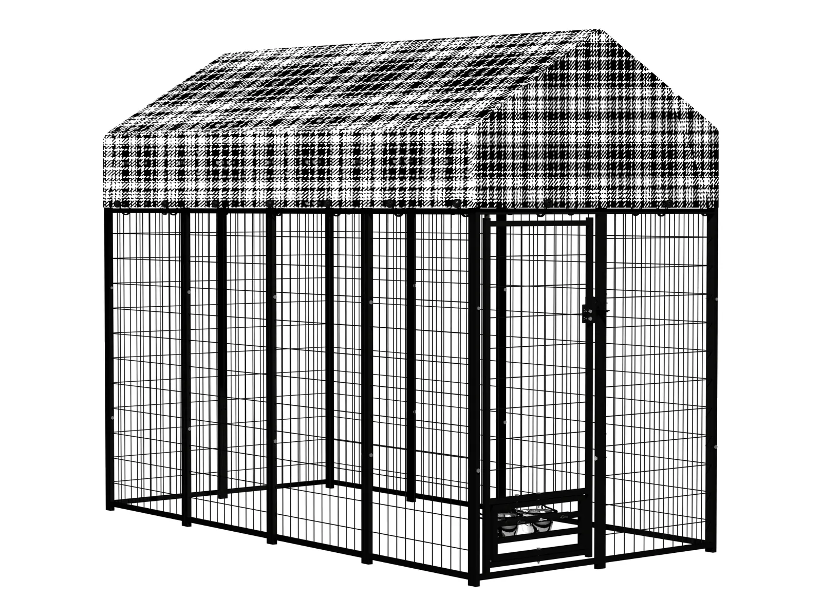
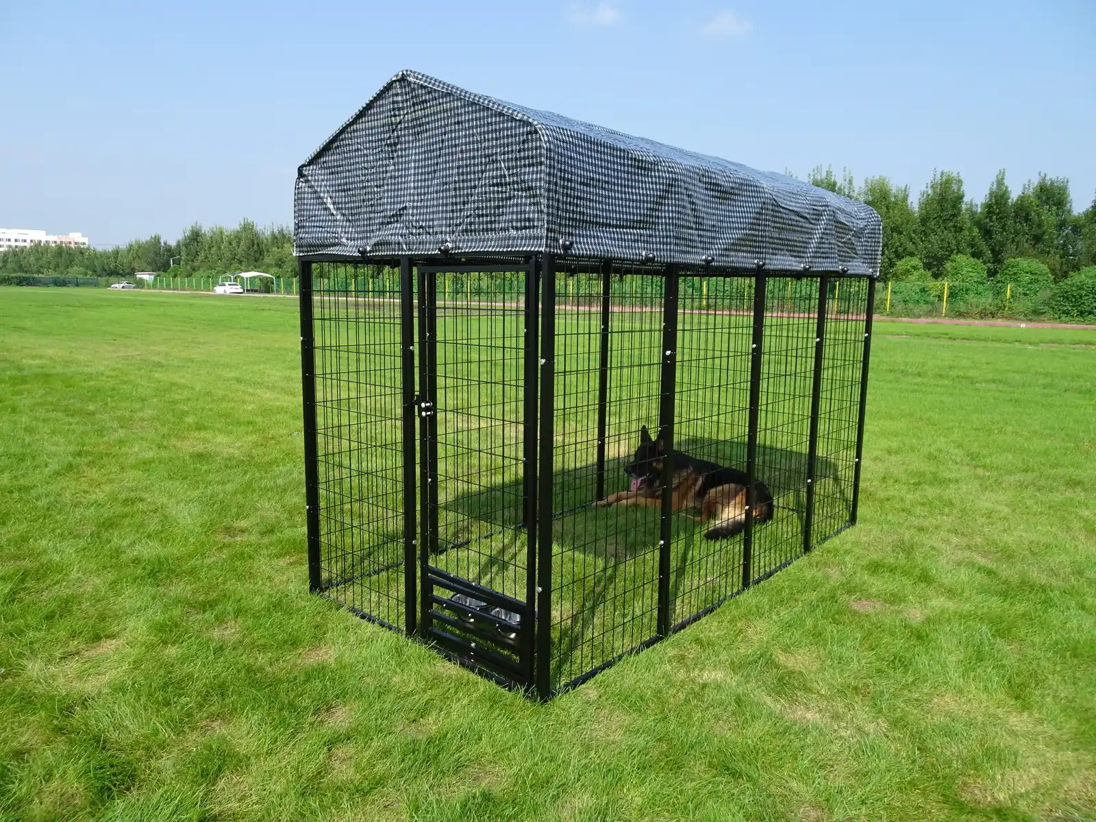
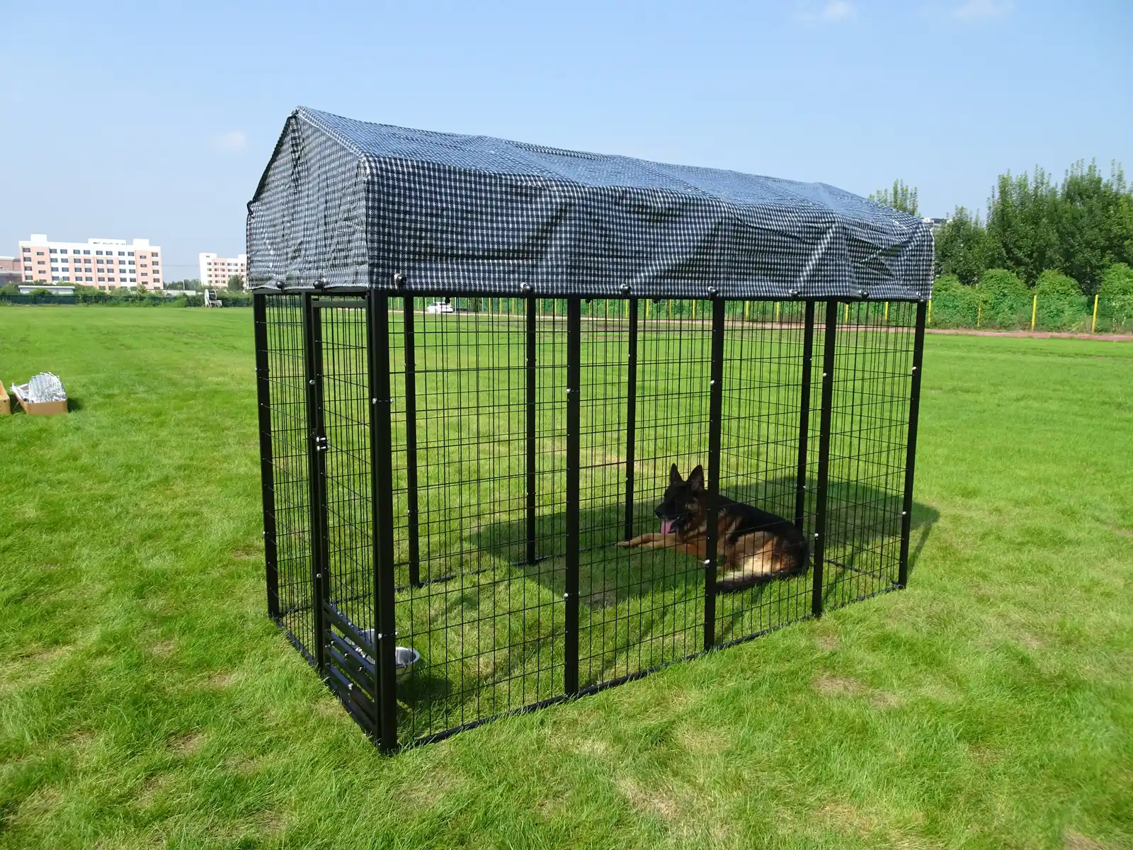
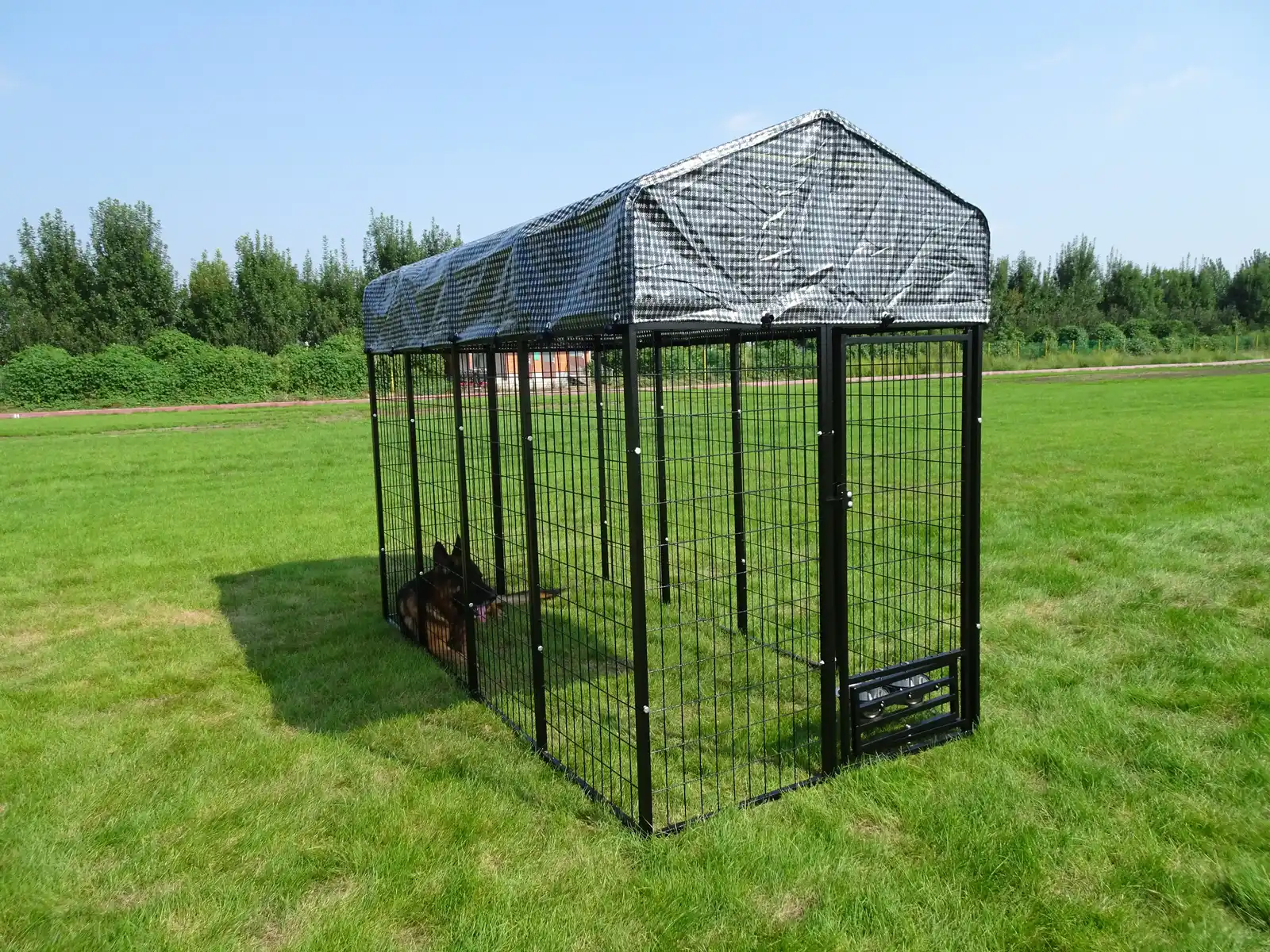
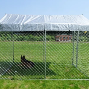
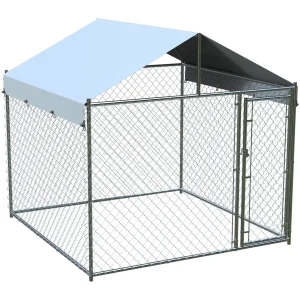
This welded wire dog kennel uses galvanized steel tubing and fully welded wire panels to form a rigid outdoor enclosure. The listed overall size is 8 ft L × 4 ft W × 6 ft H, providing a calculated ground area of approximately 32 sq ft.
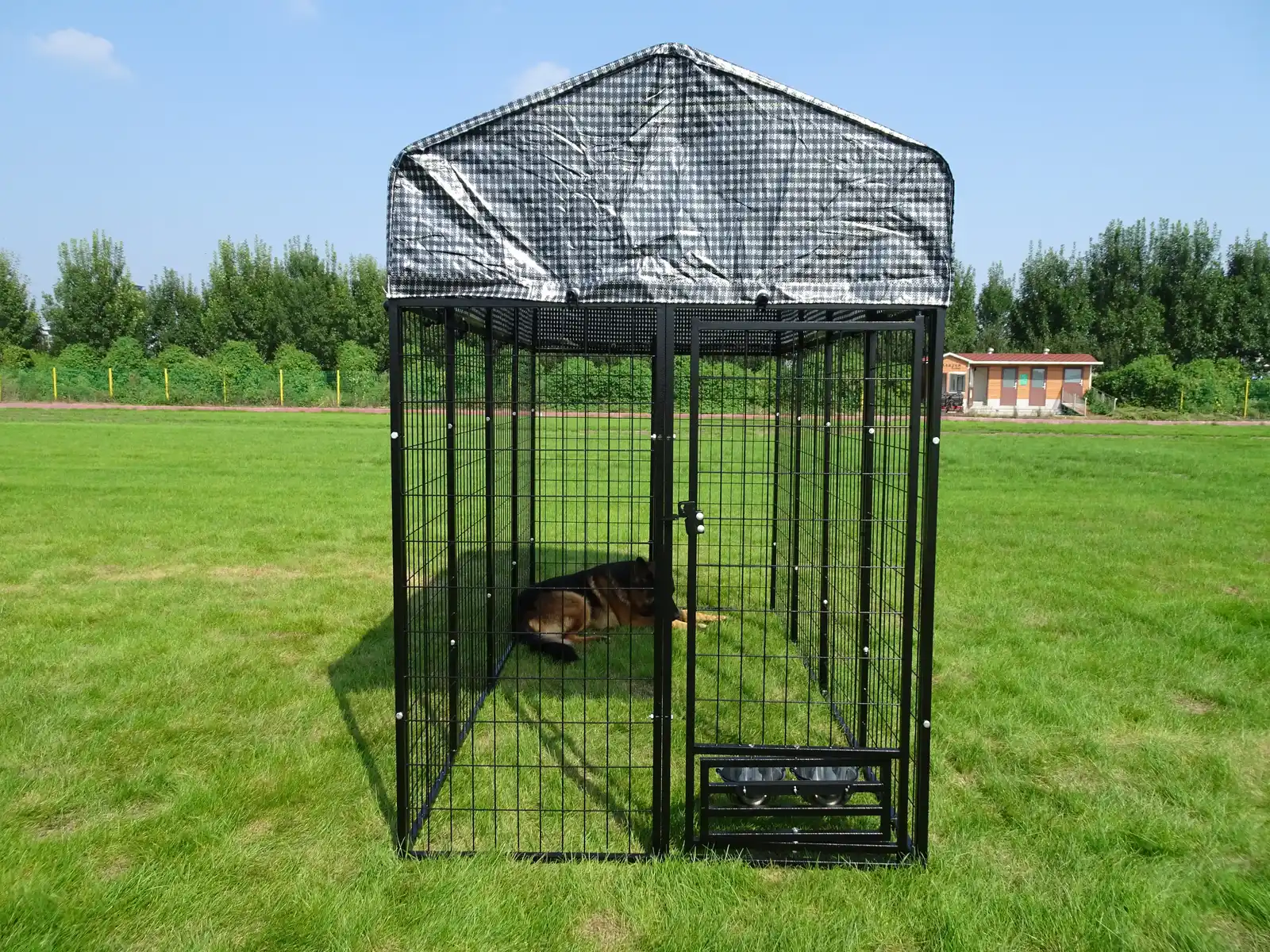
A weather-resistant canopy covers the upper area, while the open wire-panel sides maintain airflow and visibility. A 360° rotating and lockable feeding door allows food or water access without opening the main kennel entry.
Length
8 ft / 2.44 m
Width
4 ft / 1.22 m
Height
6 ft / 1.83 m
Packing
1 set / carton

CONFIRMED PRODUCT DATA
Dimensions, Materials and Packing
The measurements below are normalized to the standard length × width × height order. Metric values and ground area are calculated conversions from the confirmed imperial dimensions.
|
Overall dimensions |
8 ft L × 4 ft W × 6 ft H |
|
Metric conversion |
Approximately 2.44 m L × 1.22 m W × 1.83 m H |
|
Calculated ground area |
Approximately 32 sq ft / 2.97 m² |
|
Frame material |
Galvanized steel tubing |
|
Enclosure construction |
Fully welded wire panels |
|
Upper cover |
Weather-resistant canopy |
|
Feeding access |
360° rotating and lockable feeding door |
|
Packing |
1 set per carton |
|
Assembly instructions |
PANEL CONSTRUCTION
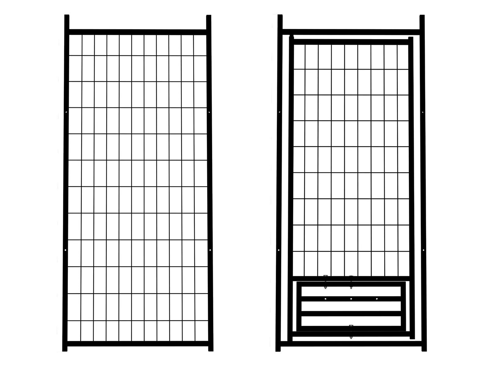
Rigid Welded Wire Enclosure
01
Galvanized Steel Tube Frame
Galvanized steel tubing forms the main support frame for the welded panel enclosure.
02
Fully Welded Wire Panels
The enclosure uses rigid welded wire panels rather than loose chain-link fabric, supporting stable panel alignment and clear visibility.
CONTROLLED FEEDING ACCESS
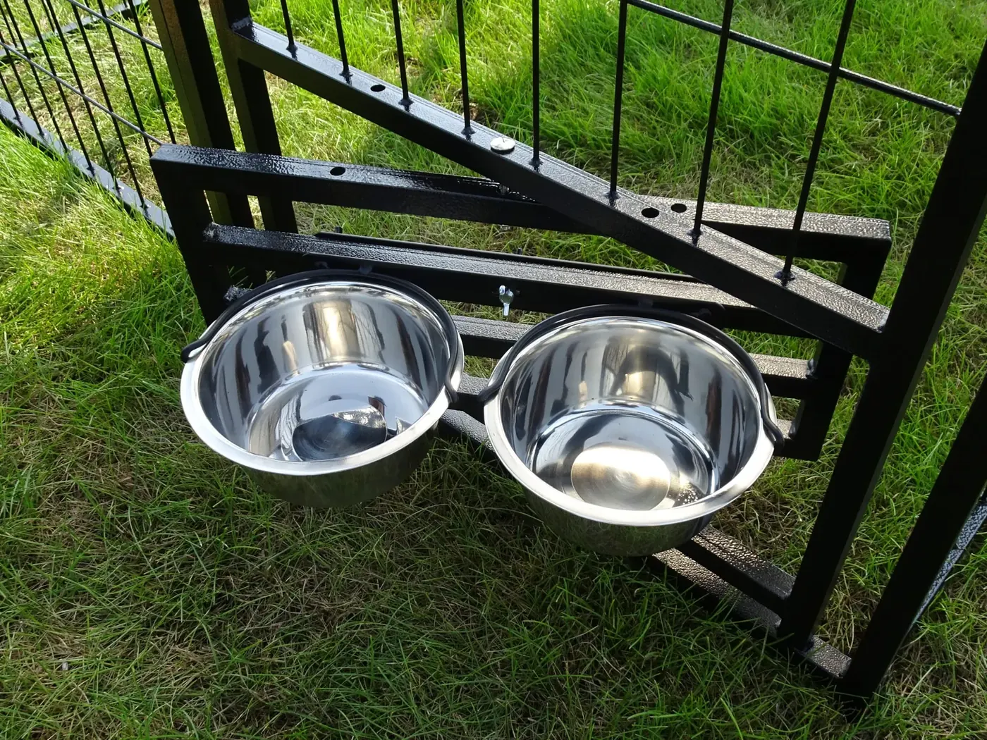
360° Rotating and Lockable Feeding Door
The feeding section can rotate through a full circle and lock in position. This design allows feeding or water access from outside the kennel without opening the main entry door.
OVERHEAD COVER
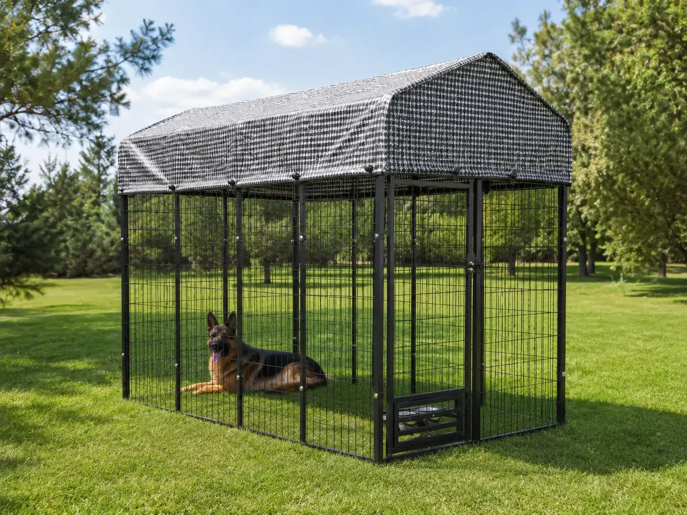
Weather-Resistant Canopy with Open-Side Airflow
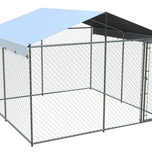
The canopy provides overhead protection from direct sun and rain. The welded wire sides remain open, supporting airflow and visual inspection from outside the enclosure.
The wire-panel sides remain open for airflow and visibility. This canopy is overhead weather protection, not a fully enclosed shelter.
PLACEMENT AND PRE-USE CONTROL
Checks Before the Kennel Is Put into Service
No universal dog capacity is stated. Suitability must be reviewed against the dog’s size, activity level, temperament, time in the enclosure and local animal-welfare requirements.
Ground Condition
Use a level, stable surface that supports the full rectangular footprint without panel distortion.
Anchoring
Confirm the required anchoring method for the installation surface and local wind conditions.
Panel Joints
Check all panel connections for complete engagement, alignment and exposed sharp points.
Door and Lock
Operate the main entry and feeding door, then verify that each lock remains secure under normal movement.
Canopy Tension
Confirm that the canopy is evenly positioned and does not collect standing water.
Routine Inspection
Recheck welds, connectors, locks, canopy condition and ground contact during regular use.
PURCHASING INFORMATION
Details to Include with an Inquiry
Providing the following information allows the supplier to confirm whether the standard configuration is suitable and identify any required changes.
01
Required order quantity and destination country or port.
02
Dog size, intended use, installation surface and expected daily enclosure time.
03
Required tube, wire, mesh, canopy, feeding-door and lock specifications.
04
Branding, carton marking, packing, shipping and target delivery requirements.
PRODUCT FAQ
Outdoor Modular Welded Dog Kennel Questions
01
What is the confirmed kennel size?
The listed size is 8 ft long × 4 ft wide × 6 ft high, equal to approximately 2.44 m × 1.22 m × 1.83 m.
02
What is the calculated ground area?
The rectangular 8 ft × 4 ft footprint provides approximately 32 sq ft, or 2.97 m², of ground area.
03
Can feeding be completed without opening the main door?
Yes. The confirmed design includes a 360° rotating and lockable feeding door for external food or water access.
04
Is the kennel fully weatherproof?
No such claim is confirmed. The product includes a weather-resistant overhead canopy, while the welded wire sides remain open.
05
How is the product packed?
The confirmed packing quantity is one complete set per carton. Carton size, net weight and gross weight require quotation confirmation.
06
Are assembly instructions available?
Yes. Step-by-step assembly instructions are available for this model. Download the assembly instructions PDF.
Use note: The kennel should be placed on a stable surface and checked regularly for secure joints, locks, canopy tension and exposed sharp points.
SPECIFICATION REVIEW
Request a Specification-Based Quotation
Send the required quantity, destination, intended use, technical requirements, packing needs, and target delivery schedule.
@media (max-width: 767px) {
body.single-product .woocommerce-tabs,
body.single-product .woocommerce-Tabs-panel,
body.single-product .woocommerce-Tabs-panel–description {
overflow-x: hidden !important;
}
body.single-product .woocommerce-Tabs-panel–description *,
body.single-product .woocommerce-tabs .panel * {
box-sizing: border-box !important;
}
body.single-product .woocommerce-Tabs-panel–description section,
body.single-product .woocommerce-tabs .panel section {
width: 100% !important;
max-width: 100% !important;
margin-left: 0 !important;
margin-right: 0 !important;
padding-left: 16px !important;
padding-right: 16px !important;
}
body.single-product .woocommerce-Tabs-panel–description [style*=”width:100vw”],
body.single-product .woocommerce-Tabs-panel–description [style*=”width: 100vw”],
body.single-product .woocommerce-tabs .panel [style*=”width:100vw”],
body.single-product .woocommerce-tabs .panel [style*=”width: 100vw”] {
width: 100% !important;
max-width: 100% !important;
margin-left: 0 !important;
margin-right: 0 !important;
}
body.single-product .woocommerce-Tabs-panel–description [style*=”display:grid”],
body.single-product .woocommerce-Tabs-panel–description [style*=”display: grid”],
body.single-product .woocommerce-tabs .panel [style*=”display:grid”],
body.single-product .woocommerce-tabs .panel [style*=”display: grid”] {
grid-template-columns: 1fr !important;
gap: 20px !important;
}
body.single-product .woocommerce-Tabs-panel–description [style*=”grid-column”],
body.single-product .woocommerce-tabs .panel [style*=”grid-column”] {
grid-column: auto !important;
}
body.single-product .woocommerce-Tabs-panel–description [style*=”display:flex”],
body.single-product .woocommerce-Tabs-panel–description [style*=”display: flex”],
body.single-product .woocommerce-tabs .panel [style*=”display:flex”],
body.single-product .woocommerce-tabs .panel [style*=”display: flex”] {
flex-wrap: wrap !important;
}
body.single-product .woocommerce-Tabs-panel–description [style*=”minmax(300px”],
body.single-product .woocommerce-Tabs-panel–description [style*=”minmax(320px”],
body.single-product .woocommerce-Tabs-panel–description [style*=”minmax(340px”],
body.single-product .woocommerce-Tabs-panel–description [style*=”minmax(360px”],
body.single-product .woocommerce-Tabs-panel–description [style*=”minmax(380px”],
body.single-product .woocommerce-Tabs-panel–description [style*=”minmax(420px”],
body.single-product .woocommerce-tabs .panel [style*=”minmax(300px”],
body.single-product .woocommerce-tabs .panel [style*=”minmax(320px”],
body.single-product .woocommerce-tabs .panel [style*=”minmax(340px”],
body.single-product .woocommerce-tabs .panel [style*=”minmax(360px”],
body.single-product .woocommerce-tabs .panel [style*=”minmax(380px”],
body.single-product .woocommerce-tabs .panel [style*=”minmax(420px”] {
grid-template-columns: 1fr !important;
}
body.single-product .woocommerce-Tabs-panel–description [style*=”min-width:300px”],
body.single-product .woocommerce-Tabs-panel–description [style*=”min-width: 300px”],
body.single-product .woocommerce-Tabs-panel–description [style*=”min-width:320px”],
body.single-product .woocommerce-Tabs-panel–description [style*=”min-width: 320px”],
body.single-product .woocommerce-Tabs-panel–description [style*=”min-width:340px”],
body.single-product .woocommerce-Tabs-panel–description [style*=”min-width: 340px”],
body.single-product .woocommerce-Tabs-panel–description [style*=”min-width:360px”],
body.single-product .woocommerce-Tabs-panel–description [style*=”min-width: 360px”],
body.single-product .woocommerce-tabs .panel [style*=”min-width:300px”],
body.single-product .woocommerce-tabs .panel [style*=”min-width: 300px”],
body.single-product .woocommerce-tabs .panel [style*=”min-width:320px”],
body.single-product .woocommerce-tabs .panel [style*=”min-width: 320px”],
body.single-product .woocommerce-tabs .panel [style*=”min-width:340px”],
body.single-product .woocommerce-tabs .panel [style*=”min-width: 340px”],
body.single-product .woocommerce-tabs .panel [style*=”min-width:360px”],
body.single-product .woocommerce-tabs .panel [style*=”min-width: 360px”] {
min-width: 0 !important;
}
body.single-product .woocommerce-Tabs-panel–description h1,
body.single-product .woocommerce-Tabs-panel–description h2,
body.single-product .woocommerce-tabs .panel h1,
body.single-product .woocommerce-tabs .panel h2 {
max-width: 100% !important;
font-size: clamp(28px, 8vw, 36px) !important;
line-height: 1.18 !important;
letter-spacing: 0 !important;
overflow-wrap: anywhere !important;
text-wrap: balance;
}
body.single-product .woocommerce-Tabs-panel–description h3,
body.single-product .woocommerce-tabs .panel h3 {
font-size: 20px !important;
line-height: 1.28 !important;
overflow-wrap: anywhere !important;
}
body.single-product .woocommerce-Tabs-panel–description p,
body.single-product .woocommerce-Tabs-panel–description li,
body.single-product .woocommerce-tabs .panel p,
body.single-product .woocommerce-tabs .panel li {
font-size: 16px !important;
line-height: 1.66 !important;
overflow-wrap: anywhere !important;
}
body.single-product .woocommerce-Tabs-panel–description img,
body.single-product .woocommerce-Tabs-panel–description video,
body.single-product .woocommerce-Tabs-panel–description svg,
body.single-product .woocommerce-tabs .panel img,
body.single-product .woocommerce-tabs .panel video,
body.single-product .woocommerce-tabs .panel svg {
max-width: 100% !important;
height: auto !important;
}
body.single-product .woocommerce-Tabs-panel–description a,
body.single-product .woocommerce-Tabs-panel–description button,
body.single-product .woocommerce-Tabs-panel–description summary,
body.single-product .woocommerce-tabs .panel a,
body.single-product .woocommerce-tabs .panel button,
body.single-product .woocommerce-tabs .panel summary {
min-height: 44px;
align-items: center;
}
body.single-product .woocommerce-Tabs-panel–description [style*=”transform:translate”],
body.single-product .woocommerce-Tabs-panel–description [style*=”transform: translate”],
body.single-product .woocommerce-tabs .panel [style*=”transform:translate”],
body.single-product .woocommerce-tabs .panel [style*=”transform: translate”] {
transform: none !important;
}
body.single-product .woocommerce-Tabs-panel–description [style*=”padding:84px”],
body.single-product .woocommerce-Tabs-panel–description [style*=”padding:80px”],
body.single-product .woocommerce-Tabs-panel–description [style*=”padding:78px”],
body.single-product .woocommerce-Tabs-panel–description [style*=”padding:72px”],
body.single-product .woocommerce-Tabs-panel–description [style*=”padding:68px”],
body.single-product .woocommerce-Tabs-panel–description [style*=”padding:64px”],
body.single-product .woocommerce-tabs .panel [style*=”padding:84px”],
body.single-product .woocommerce-tabs .panel [style*=”padding:80px”],
body.single-product .woocommerce-tabs .panel [style*=”padding:78px”],
body.single-product .woocommerce-tabs .panel [style*=”padding:72px”],
body.single-product .woocommerce-tabs .panel [style*=”padding:68px”],
body.single-product .woocommerce-tabs .panel [style*=”padding:64px”] {
padding: 44px 16px !important;
}
body.single-product .woocommerce-Tabs-panel–description [style*=”margin:56px auto”],
body.single-product .woocommerce-tabs .panel [style*=”margin:56px auto”] {
margin: 32px auto !important;
}
}
@media (min-width: 768px) and (max-width: 1024px) {
body.single-product .woocommerce-Tabs-panel–description [style*=”grid-template-columns:repeat(4″],
body.single-product .woocommerce-Tabs-panel–description [style*=”grid-template-columns: repeat(4″],
body.single-product .woocommerce-tabs .panel [style*=”grid-template-columns:repeat(4″],
body.single-product .woocommerce-tabs .panel [style*=”grid-template-columns: repeat(4″] {
grid-template-columns: repeat(2, minmax(0, 1fr)) !important;
}
}
/* Force all replaced image wrappers and related sections to stay transparent */
.hsmwdk .hsmwdk-hero,
.hsmwdk .hsmwdk-structure,
.hsmwdk .hsmwdk-feeder,
.hsmwdk .hsmwdk-canopy{
background: transparent !important;
}
.hsmwdk .hsmwdk-hero-art,
.hsmwdk .hsmwdk-figure,
.hsmwdk .hsmwdk-feeder-art,
.hsmwdk .hsmwdk-canopy-art,
.hsmwdk .hsmwdk-hero-art::before,
.hsmwdk .hsmwdk-figure::before,
.hsmwdk .hsmwdk-feeder-art::before,
.hsmwdk .hsmwdk-canopy-art::before,
.hsmwdk .hsmwdk-hero-art::after,
.hsmwdk .hsmwdk-figure::after,
.hsmwdk .hsmwdk-feeder-art::after,
.hsmwdk .hsmwdk-canopy-art::after{
background: transparent !important;
background-color: transparent !important;
border: 0 !important;
box-shadow: none !important;
}
.hsmwdk .hsmwdk-hero-art,
.hsmwdk .hsmwdk-figure,
.hsmwdk .hsmwdk-feeder-art,
.hsmwdk .hsmwdk-canopy-art{
padding: 0 !important;
}
.hsmwdk .hsmwdk-hero-art img,
.hsmwdk .hsmwdk-figure img,
.hsmwdk .hsmwdk-feeder-art img,
.hsmwdk .hsmwdk-canopy-art img{
display:block;
width:100%;
height:auto;
margin:0;
background: transparent !important;
background-color: transparent !important;
box-shadow:none !important;
}
Reviews
There are no reviews yet.